Optimizely
branding / art direction / event (see event section) / product design + illustration / iconography
Though our product illustrations were simplistic, we wanted to make sure our product page “how it all works” illustrations had some animations and were more detailed. So we had some elements stay simple that didn’t need to be called out and distract from what the important info was, but designed multiple frames with a detailed walkthrough for our animators to make these awesome, tag-team animations.
Each person on our brand team has been responsible for a set of our product illustrations. Our latest version was all built in Figma, and in both light and dark mode. We simplified our illustrations from the use of photography and language in order to make the designs more universal.
A key project I’ve been responsible for leading is building out our brand system for various ad assets. As our look and feel evolves, I make sure all of our touchpoints reflect that, such as going from flat colors to liquid gradients. To ensure our ads don’t become too repetitive, each of our 13 templates also come in various color ways. On that note, our design templates cover speakers, text-only, logos, ebooks, illustrations and reports. This allows us to be quick, efficient and consistent when processes requests.
Our Instagram used to be severely unbranded, obscure, and very bare. I had fellow coworkers tell me that they looked up Optimizely before being hired to see what it was all about, and still had no idea.
So I art directed our Optimizely Instagram style guide, with different types of posts being branded in particular ways.
Even though we quickly outgrew those first guidelines, we made sure our main goal was to make our Instagram account show off the culture and be boldly branded.
Optimizely produces ebooks in English, Swedish and German. I had the pleasure of revamping our ebook style guide to include more blocks of color, our fun noodle accents, and curved edges for callouts. These adjustments allow for the (semi-dry) information to be understood and sifted through much easier.
The prior Powerpoint template for employees to use was extremely limited, with locked layers, and hardly any brand colors. I proceeded to completely redo the template, growing the master to 56 slides for employees to build their presentations—functionally. I also included 5 “accessory” slides with a mini brand guideline, svg logos of brands, and color combinations of arrows, boxes and pills.
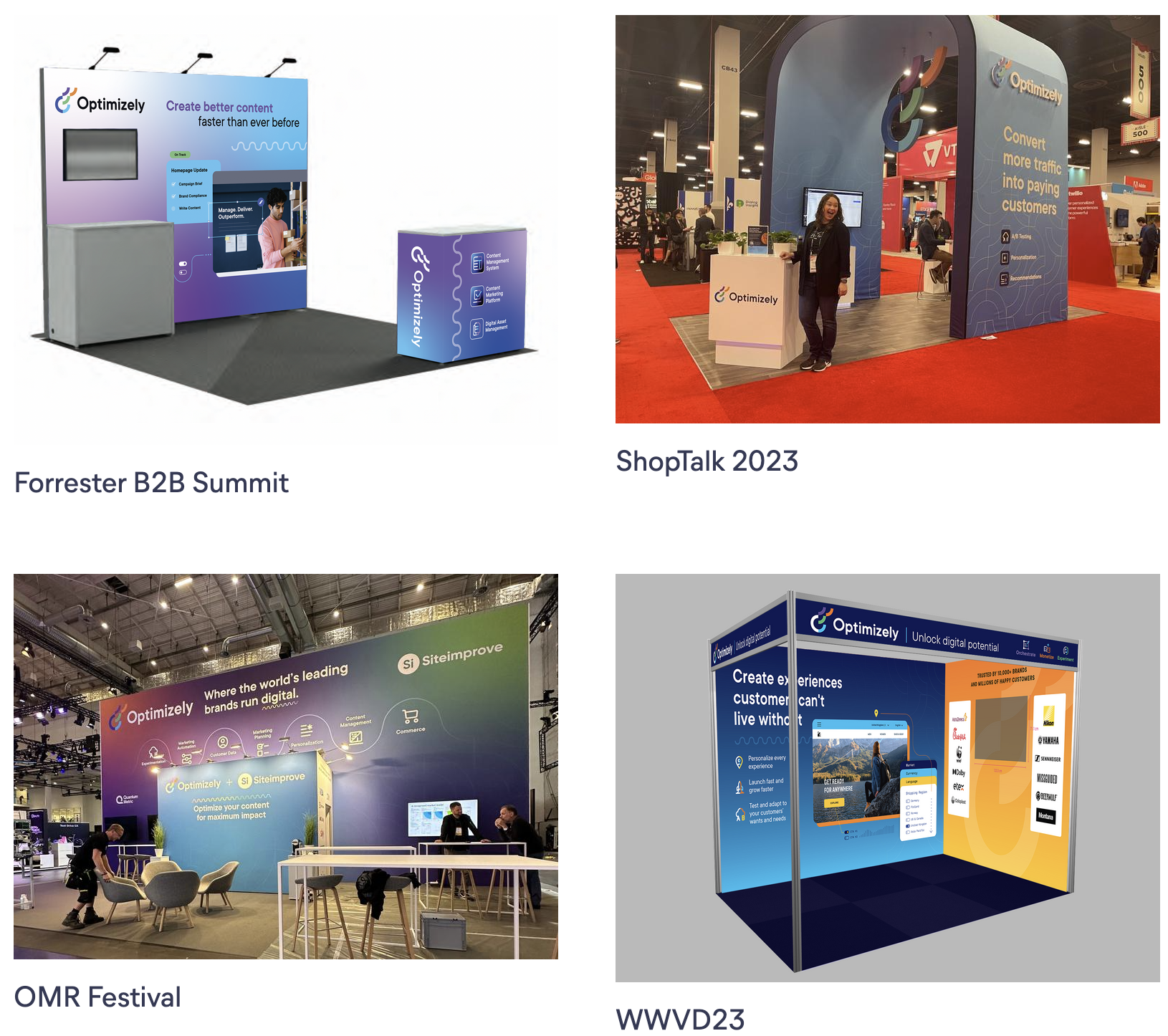
At Optimizely, we have a Brand Portal for all of our resources, and this is an “Event Kit” page I dreamed up to make the event requests a bit more streamlined. Included, we have approved copy for each solution, tips for banner details, swag ideas and considerations, as well as past examples to be inspired by.
One of the major projects I was able to lead, was the redesign and addition of badges in our system. Our badges include those awarded to Partners, education courses completed, and certifications and specializations. I wanted to make sure our outward-facing badges were streamlined in branded, color hierarchy (first three rows). Then our learning and development badges could be more playful, incorporating the full spectrum of our brand colors since these are only personally displayed.
The rest of the team was then able to use the systems and designs that were established to branch out for the following two rows, maintaining color and shape for branded consistency.


